A plot is better than countless words

After two weeks of some complicated articles, let’s take a break and turn to our previous topic “Data Analysis” and introduce another important tool when working on the data analysis- data visualization!
If you forget what we have done few weeks ago, you can go back, review on them and come back again~~
Table of Contents
There are many packages that could be used in Python to do the data visualization. In addition to Matplotlib, there are other packages to plot such as plotly, seaborn, cufflinks, etc. The logic and syntax are similar when working on those packages, but because the connection between Matplotlib and pandas is relatively closer, we will use it for the introduction in this article.
If you want to read the whole document of Matplotlib, you could go through this link: Matplotlib👍👍
Let’s code step by step!
We first get the stock price data of TSMC(2330) and UMC(2303) from the TEJ API.
import tejapi
tejapi.ApiConfig.api_key = "your key"
TSMC = tejapi.get(
    'TWN/EWPRCD',
    coid = '2330',
    mdate={'gte':'2020-06-01', 'lte':'2021-04-12'},
    opts={'columns': ['mdate','open_d','high_d','low_d','close_d', 'volume']},
    paginate=True
    )
UMC = tejapi.get(
    'TWN/EWPRCD',
    coid = '2303',
    mdate={'gte':'2020-06-01', 'lte':'2021-04-12'},
    opts={'columns': ['mdate','open_d','high_d','low_d','close_d', 'volume']},
    paginate=True
    )
UMC = UMC.set_index('mdate')
TSMC = TSMC.set_index('mdate')* Single-Axis Plot
TSMC['5_MA'] = TSMC['close_d'].rolling(5).mean()
plt.figure(figsize = (10, 6))
plt.plot(TSMC['close_d'], lw=1.5, label = 'Stock Price')
plt.plot(TSMC['5_MA'], lw=1.5, label = '5-Day MA')
plt.legend(loc = 0)
plt.xlabel('Date')
plt.ylabel('Stock Price')
plt.title('TSMC Stock Price vs 5-Day MA')
plt.grid()
plt.show()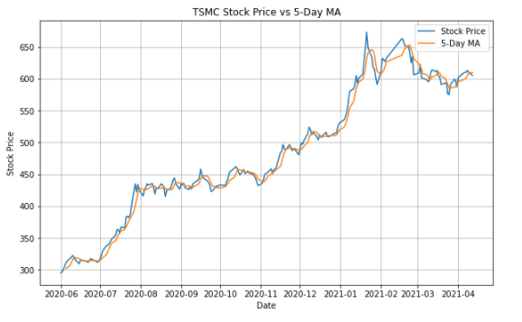
Introduction of different functions:
plt.plot(): Set the information of the plot such as length of width, color, name, etc.
plt.figure(figsize = (10,6)): Size of the plot
plt.legend(): Location of the legend
plt.grid(): Add the grid
plt.xlabel(): Name of X axis
plt.ylabel(): Name of Y axis
plt.title(): Name of title
* Dual-Axis Plot
fig, ax1 = plt.subplots(figsize=(10,8))
plt.plot(TSMC['close_d'], lw=1.5, label = '2330.TW')
plt.xlabel('Date')
plt.ylabel('Stock Price')
plt.title('TSMC VS UMC Stock Price')
plt.legend(loc=1)
ax2 = ax1.twinx()
plt.plot(UMC['close_d'], lw=1.5, color = "r",label = '2303.TW')
plt.ylabel('Stock Price')
plt.legend(loc=2)
plt.show()
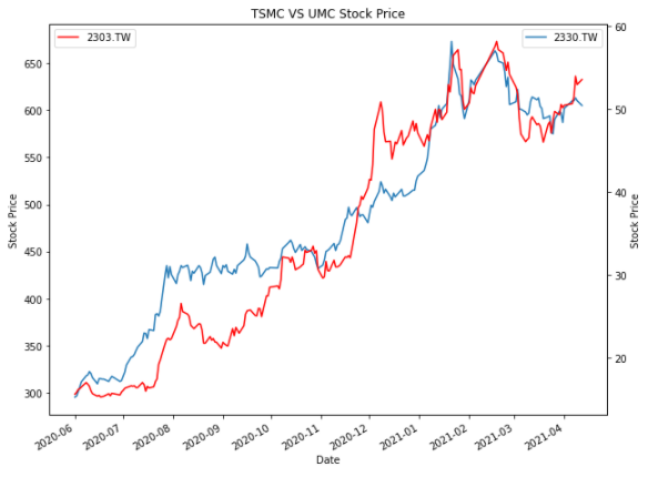
There is often a need for dual-axis plots because it is not convenient for reading if the units or magnitudes of the 2 data are different and placed on the same axis.
We use fig, ax1 = plt.subplots() and ax2 = ax1.twinx() to generate the second chart but share the X-axis of the first chart. It could be understood as making two pictures with exactly the same unit on the X-axis and then stack them up!
* Scatter Plot, Histogram, and Box Plot
##Scatter Plot
from sklearn.linear_model import LinearRegression
plt.figure(figsize = (10, 6))
plt.scatter(TSMC['close_d'], UMC['close_d'], color = 'navy')
##Regression Line
reg = LinearRegression().fit(np.array(TSMC['close_d'].tolist()).reshape(-1,1),  UMC['close_d'])
pred = reg.predict(np.array(TSMC['close_d'].tolist()).reshape(-1,1))
plt.plot(TSMC['close_d'], pred, linewidth = 2, color = 'r',label = '迴歸線')
plt.xlabel('TSMC')
plt.ylabel('UMC')
plt.title('TSMC vs UMC')
plt.show()
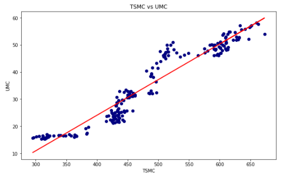
First, let’s introduce the scatter plot. It could be used to see the relationship between the two data. If we use the regression line at the same time, the correlation between the two data will be more easily observed.
##Histogram
ret_tsmc = np.log(TSMC['close_d']/TSMC['close_d'].shift(1)).tolist()
plt.figure(figsize = (10, 6))
plt.hist(ret_tsmc, bins = 25)
plt.xlabel('Log Return')
plt.ylabel('Frequency')
plt.title('Log Return vs Frequency')
plt.show()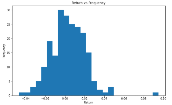
Second, let’s introduce the histogram. We can use the histogram to understand the distribution and the frequencies of the yearly log return.
##Box Plot
rv = np.random.standard_normal((1000,2))
plt.figure(figsize = (10, 6))
plt.boxplot(rv)
plt.xlabel('dataset')
plt.ylabel('value')
plt.title('ramdon variable box plot')
plt.show()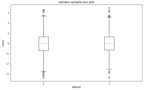
The last is the box plot, which could be used to display the statistical characteristics of the dataset and compare multiple datasets at the same time.
Let’s combine the plot we’ve mentioned above with the financial data!
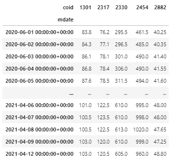
* Data Collecting
tickers = ['2330', '1301', '2317', '2454' , '2882']
df  =  tejapi.get(
        'TWN/EWPRCD',
        coid = tickers,
        mdate={'gte':'2020-06-01', 'lte':'2021-04-12'},
        opts={'columns': ['mdate', 'coid','close_d']},
        paginate=True
        )
df = df.sort_values(['coid', 'mdate']).set_index('mdate')
data = df.pivot_table(index = df.index, columns = 'coid', values = 'close_d')
data
*Pandas built-in statistical function
data.describe()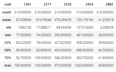
We can use Pandas to present the descriptive statistics of the underlying assets with one-line code! It is really a clear and convenient way to process the data!!
* Pandas built-in plotting
##Average Rate of Return
data.pct_change().mean().plot(kind = 'bar', figsize=(10,6))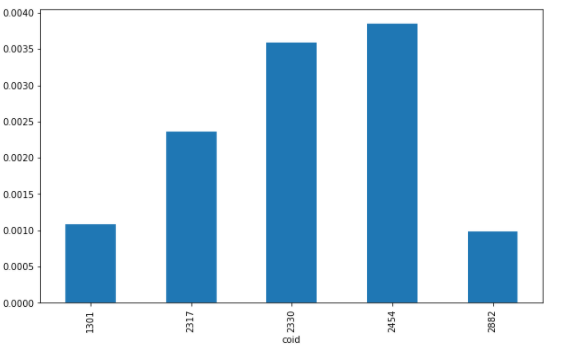
We can directly use the pandas to plot what we want. Isn’t it very convenient?
##Cumulative Log Return
ret = np.log(data/data.shift(1))
ret.cumsum().apply(np.exp).plot(figsize = (10,6))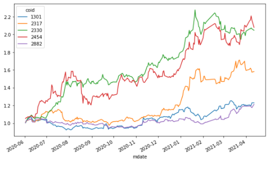
We use the DataFrame + the apply method to perform cumsum() function on the data after the log has been taken, and then perform np.exp() on the result in order to find the cumulative log return.
##High/Low/Avg
windows = 20
data['min'] = data['2330'].rolling(windows).min()
data['mean'] = data['2330'].rolling(windows).mean()
data['max'] = data['2330'].rolling(windows).max()
ax = data[['min', 'mean', 'max']].plot(figsize = (10, 6), style=['g--', 'r--', 'g--'], lw=1.2)
data['2330'].plot(ax=ax, lw=2.5)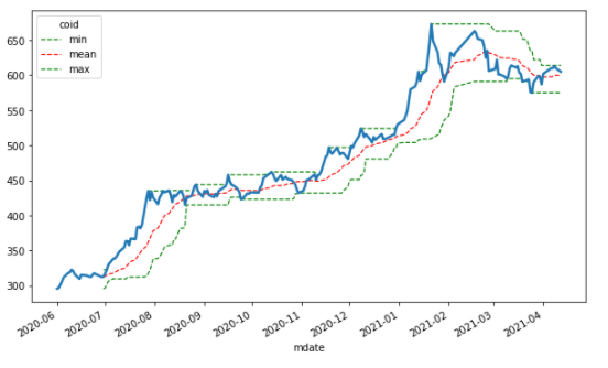
Here we use the same concept to find out the 20 days high, low, and the average price of TSMC, and style = [‘g- -’] to indicate the color and line presentation mode.
##Technical Analysis
##Long-short term moving avg.
data['SMA_5'] = data['2330'].rolling(window = 5).mean()
data['SMA_20'] = data['2330'].rolling(window = 20).mean()
data[['2330', 'SMA_5', 'SMA_20']].plot(figsize = (10,6))
ata.dropna(inplace = True)
data['Positions'] = np.where(data['SMA_5'] > data['SMA_20'], 1, -1)
ax = data[['2330', 'SMA_5', 'SMA_20', 'Positions']].plot(figsize = (10, 6), secondary_y = 'Positions')
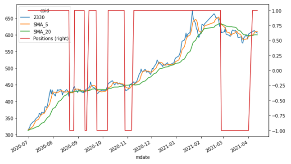
Finally, with the application of a little technical analysis, we can find the long-short term moving averages and the intersection through np.where() function. Therefore, it could be seen that when the Position changes from 1 to -1, the trading signal point is generated.
There are multiple ways to display the plots. We can only introduce the most basic methods here. If you have a high interest in plotting, you could do like explore more application websites or read documents of those packages~
Then, we will go further into financial data analysis and applications in the next article, please look forward to it ❗️❗️
Finally, if you like this topic, please click 👏 below, giving us more support and encouragement. Additionally, if you have any questions or suggestions, please leave a message or email us, we will try our best to reply to you.👍👍